A quiet, multilingual face for Kusatsu Onsen VAN.
Led design, build, and SEO for Kusatsu Onsen VAN — a bar hotel pairing curated cocktails with in-room private onsen. Figma UI, Next.js multilingual implementation (JP / EN), and Lighthouse-tuned performance.
Design the same care as the property before designing features.
VAN — Onsen Bar Hotel sits in Gunma's Kusatsu Onsen — a long-running property reborn as a "BAR and stay HOTEL," where bartenders pair a drink with each scene of the stay and every room has its own private onsen with an island-shaped mini-bar overlooking it. The brief was less about features and more about tone: a digital surface as deliberate as the property. I led the project end-to-end — design, build, infrastructure, and SEO.
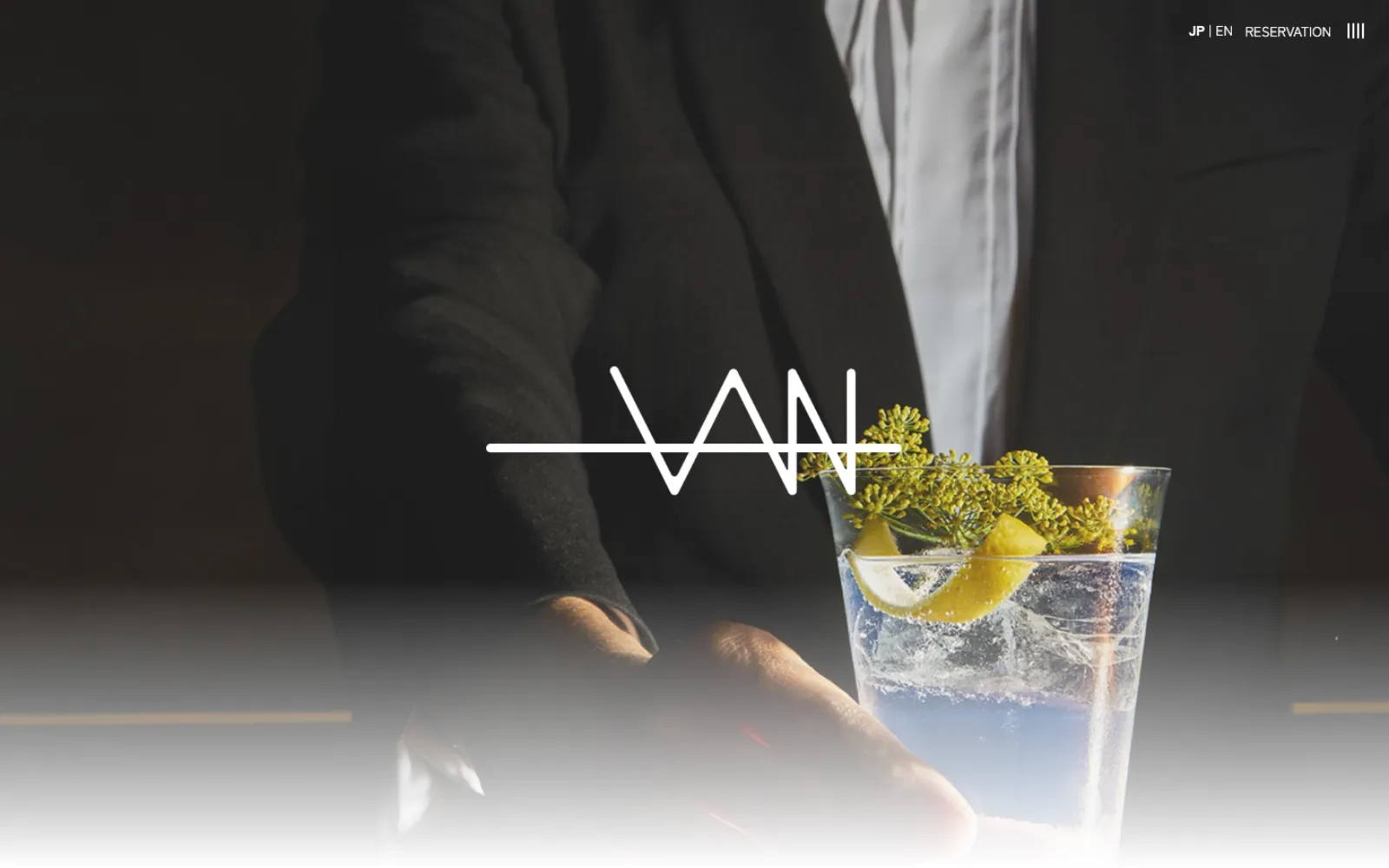
Tone is easier to break than a functional requirement.
- "Right tone" is the success criterion, but qualitative. No metric tells you the site feels like the inn — it either does or it doesn't.
- Multilingual is expensive to retrofit. Adding i18n into routing, layout, and copy interfaces after launch costs more than building it in once.
- SEO touches every layer. Markup, image strategy, performance, and content all influence discoverability — treating it as polish means rework everywhere.
Design for stillness, then make it perform.
Designed in Figma for the brand's quiet voice
A bar hotel could easily lean into nightlife flash. VAN does the opposite — the experience is theatrical only at the bar. Restrained typography, generous white space, large horizontal photography, restrained motion. The site sets expectations the property then exceeds in person.
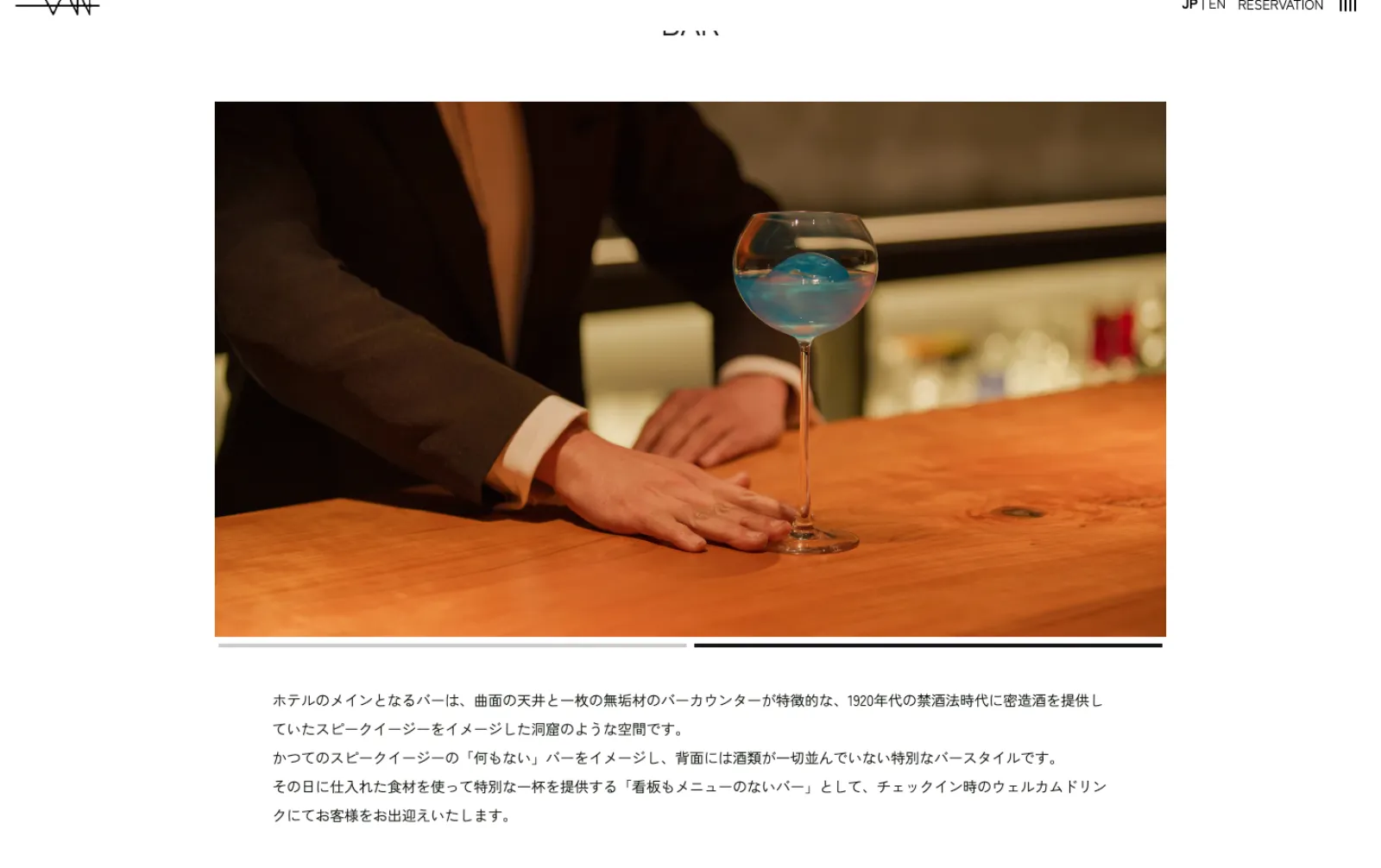
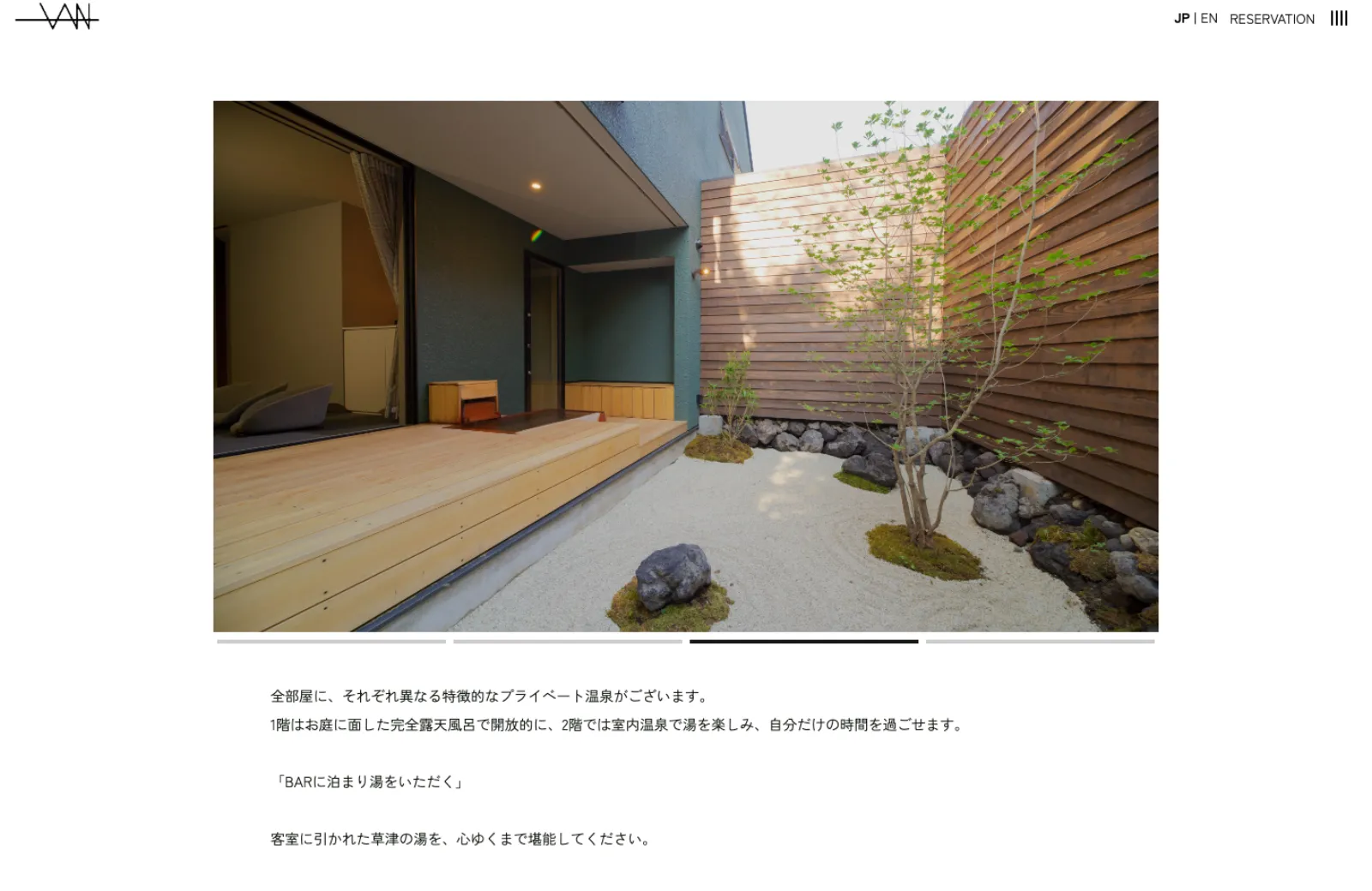
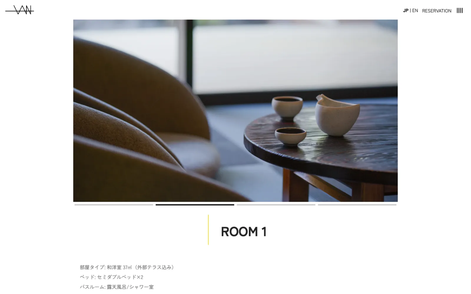
Built multilingual structure first, copy second
For two languages (JP / EN), i18n structure had to come before content. I designed routing and copy interfaces so translators could work in parallel without touching layout, making later language additions cheap.
SEO from day one, not as an afterthought
Used Semrush for keyword research before content, and tuned the site against Lighthouse as I built it: image optimization, font subsetting, careful component composition. SEO was a constraint that shaped design decisions, not a polish step.
Launched with a structure that keeps working quietly.
- Shipped a site whose tone matches the inn's. Tone, not feature count, was the criterion.
- Multilingual was structural, not bolted on. Future language additions could stay content tasks, not refactors.
- SEO baked into the build. Performance and discoverability didn't need a second pass.
Keep the atmosphere from depending on one person's taste.
In maintenance, the quiet tone can slowly break down every time a new notice, image, or section is added. I kept image scale, copy length, spacing, and JP/EN content granularity consistent so later updates would not dilute the VAN atmosphere. The quietness of the brand was treated less as visual taste and more as an editorial rule that can survive updates.